This article has been authored by team Ghostline Legal.
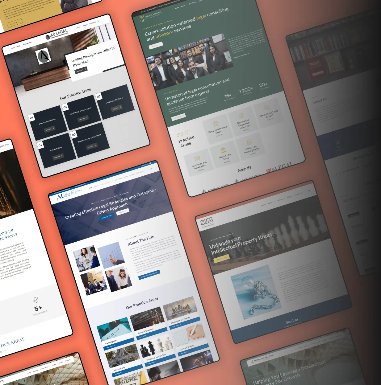
You might think that once a law firm has a slick logo and a good practice description, the website is all set. But we’ve been peeking under the hood of some of the top Indian law firm websites and what we found might surprise you.
User experience (UX) is more than just aesthetics. It’s how easily someone can navigate your site, find what they need, and decide if they want to get in touch. A polished website that loads fast but makes visitors work to understand what you do is silently working against you.
Below, we share common UX problems we’ve seen across several law firm sites—along with simple, practical fixes that don’t require a full redesign.
1. The Homepage Looks Like a Brochure, Not a Welcome Mat
Many law firm websites still use hero banners with vague taglines like “Trusted Legal Excellence” or “Your Legal Partner.” They look clean, yes. But what do they actually say?
The problem: Visitors land on the homepage and feel unsure of what the firm really does, or who it’s for.
The fix:
Add a clear value proposition above the fold. For example: “Helping Startups Navigate Legal Compliance in India Since 2008.”
Use client-centric language, not just firm accolades.
- Include a call-to-action that leads somewhere useful: consultation booking, key service pages, or insights.
2. Navigation That’s… Kind of a Maze
Too many top-tier firms bury their key pages under a clunky menu or use jargon-heavy labels like “Expertise” or “Practice Verticals” that confuse first-time visitors.
The problem: If I’m looking for a property lawyer, I don’t want to click through four dropdowns to find “Real Estate & Infrastructure.”
The fix:
Keep the top menu simple and intuitive.
Use familiar language: “Services” instead of “Expertise,” “About” instead of “Who We Are.”
Highlight popular services directly in the menu or a sidebar.
3. The ‘About Us’ Page Is a Wall of Text
You’ve seen it: a long narrative about the firm’s journey, values, founding year, and more—but without any structure or visual cues.
The problem: Most visitors skim. Large blocks of text = high exit rate.
The fix:
Break content into short paragraphs, with subheadings like “Our Story,” “Our Values,” or “Meet the Team.”
Add team photos and bios with personality, not just designations.
Mention the firm’s unique edge—what makes you different from 20 other firms doing the same thing?
4. No Clear Contact Flow
This one’s surprisingly common: the “Contact Us” button either hides at the bottom of the page or leads to a form without any context or instructions.
The problem: You’re making it hard for someone who’s ready to speak to you.
The fix:
Make your contact button sticky or place it in the header.
Add direct phone numbers, office locations, and clear CTAs like “Talk to a Lawyer” or “Request a Call.”
If you’re using a form, keep it short: name, email, query. That’s enough.
5. Zero Mobile Optimisation (or Pretend Responsiveness)
A good-looking desktop site often turns into a slow, squashed mess on phones. Fonts get tiny, buttons overlap, and carousels don’t swipe properly.
The problem: Over 65% of users in India now browse on mobile. If your site isn’t mobile-friendly, you’re invisible to half your audience.
The fix:
Use responsive frameworks or update your CMS settings.
Test on multiple devices—not just an iPhone.
Avoid pop-ups on mobile. They’re harder to close and often block content.
6. Unclear or Missing Practice Area Pages
Many firm websites mention practice areas only in passing, or tuck them into PDF downloads. Sometimes, they’re all grouped under one page with generic descriptions.
The problem: This fails both users and search engines. It’s also a lost branding opportunity.
The fix:
Create individual service pages with simple, skimmable descriptions.
Include real examples: “We helped a logistics company recover ₹40 lakhs in dues through pre-litigation recovery.”
Add internal links: from blog posts to service pages, and vice versa.
7. Blog Feeds That Feel Like a Dumping Ground
The firm does have a blog, but it’s either:
A graveyard of three articles from 2019,
Or packed with updates on obscure SEBI circulars nobody outside the legal world reads.
The problem: Visitors come for insights, not statutes. And nothing kills credibility faster than a dead blog.
The fix:
Write helpful, real-world content: FAQs, case studies, short explainers.
Post once a month consistency matters more than volume.
Connect the dots between blog topics and services. Each post should support your expertise.
8. No Visual or Brand Identity
Beyond the logo, many law firm websites look generic. Same fonts, same muted colours, same predictable layout.
The problem: Clients won’t remember you if your website blends in with ten others.
The fix:
Build a visual language with 2–3 strong colours, consistent font choices, and icons that match your tone.
Use custom illustrations or photographs—not just stock images of gavels and handshakes.
Include microcopy with personality: Think button labels like “Let’s Talk” instead of “Submit.”
In Closing
Law firms don’t need flashy websites. But they do need functional ones. Good UX isn’t about bells and whistles it’s about clarity, ease, and trust.
At Ghostline Legal, we’ve reviewed over 200+ law firm websites across India, and the pattern is clear: most firms are unintentionally turning away potential clients through poor digital experience.
These aren’t hard problems to fix. A few smart design tweaks, some user-first thinking, and a bit of clean copywriting can make your website do what it was always supposed to convert.
Stand out online with a custom law firm website – Get in touch with us!