This article has been authored by team Ghostline Legal.
When clients first visit a law firm’s website, visual cues speak before any text. Color and typography set the tone: they can put a visitor at ease or make them doubt. In fact, color “triggers psychological responses before a single word is read”. This means a firm’s palette and fonts form part of its handshake with potential clients. If the colors look calm and the text is easy to read, visitors are more likely to feel they’ve found a reliable lawyer.
For law practices today, marketing isn’t about selling. It’s about establishing immediate, unshakable confidence & trust in your values and services.
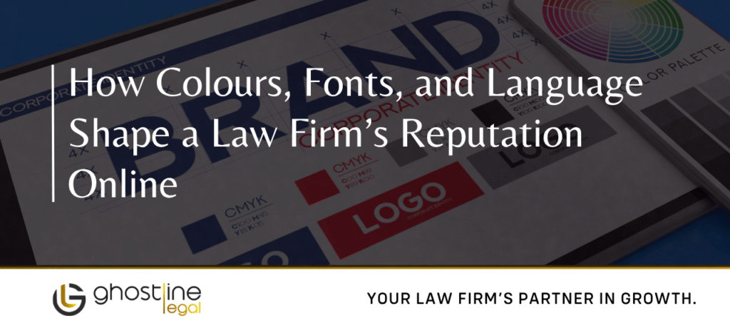
What Your Branding Colours Say
The colors you choose for your website, logo, and documents are the first words your brand speaks. Studies show that a massive portion, up to 90%, of a person’s first impression of a brand is based on color alone.
Consider how branding colors convey meaning. For example, Trilegal – one of India’s top firms – uses a deep navy-blue theme on its website and offices (above), signaling trust and stability. Blue is by far the most popular color in legal branding, because it “evokes trust, calm, and intelligence”. Likewise, Cyril Amarchand Mangaldas (CAM) chose a rich violet-purple in its logo: Interbrand notes that purple represents “wisdom, integrity, dignity and ambition”. These color choices are no accident. A blue or purple scheme can reassure clients that your firm is both professional and wise.
The color you pick reveals your firm’s main message. Are you focused on broad, steady reliability (blue), or specialized, high-end service (purple)?
| Colour | Key Message | Strategic Goal |
| Dark Blue | Trust, Stability, Authority, Dependability | Institutional Reliability and Broad Confidence |
| Purple/Violet | Wisdom, Luxury, Sophistication, Dignity | Market Leadership and Prestige (The Premium Advisor) |
| Red/Burgundy | Power, Authority, Determination | Boldness, Litigation Focus, or Modern Strength |
| Gold/Yellow | Prestige, Success, Premium Quality | High-Value Specialization and Affluence |
| Gray/Charcoal | Sophisticated Neutrality, Balance | Modern Authority and Professionalism |
Fonts and Typography
Good typography is just as important as color. Clean, readable fonts help website visitors absorb information without strain – building confidence. The right font choices subtly reinforce a firm’s personality (classic or modern) while keeping text legible on screen. Generally:
Sans-serif fonts (open and modern): These lack the little tail lines at letters’ ends. Modern san-serif fonts like Open Sans, Roboto or Barlow are very popular on law sites for their clarity. For instance, Open Sans is described as “neutral, approachable and friendly” and appears on ~25% of law firm sites. Similarly, Roboto is “modern, clean and highly legible”, making it ideal for body text. Such fonts render crisply on any device and feel welcoming rather than fussy.
Serif fonts (traditional): Serif fonts like Georgia or Garamond have extra strokes on letters. They feel more formal and classic. Many firms use a serif font for headings or printed documents and a sans-serif for web body text, blending tradition with modernity. In fact, pairing fonts is common: e.g. Helvetica Neue (sans-serif) with Garamond (serif), or Montserrat with Courier New. These combos provide a visual contrast that highlights headings while keeping paragraphs easy to read.
Font Pairings for Branding: A well-chosen pairing can suggest credibility. For example, international law firm Slaughter & May uses Open Sans everywhere for a clean look. Other firms might pick a distinctive heading font plus a simple body font (e.g. a bold display font over Roboto text) to add polish. The goal is always readability: complex fonts or very tight letter-spacing can hurt legibility, especially on phones or tablets.
Generally, the best fonts for law firm websites “drive positive associations of credibility and trust”. That means favoring simplicity and legibility over novelty. A font with a clean, open design implies no-nonsense professionalism. (As the digitaltrends guide notes, Barlow — a modern, slightly rounded sans-serif — “conveys professionalism through clarity”.) In contrast, a very decorative font might look stylish but could distract or frustrate readers.
Language and Tone
Just as images and type set expectations, so do your words. The language on a law firm website should be clear, consistent, and authentic. Visitors should feel they’re talking to real people, not reading a legal textbook.
Use Plain Language: Break down legal ideas into simple terms. Avoid heavy jargon or long, technical sentences. As one marketing guide advises, explain legal concepts in “plain language” and “avoid jargon when presenting legal concepts or services”. A sentence like “We specialize in corporate mergers and acquisitions” is better than a convoluted clause packed with legalisms. Plain, direct wording makes your firm seem helpful rather than cryptic.
Be Consistent: Whether your brand voice is formal or friendly, keep it steady across pages. Consistency helps clients recognize your firm and builds trust. For example, if your homepage sounds authoritative, but your blog reads like a casual chat, visitors may be confused. A marketing study notes that “a consistent tone across all marketing channels helps your audience instantly recognize your firm” and that this familiarity “fosters loyalty”.
Match Your Values: Let the tone reflect your firm’s personality. If your brand values compassion, use warm and reassuring language. If your focus is serious corporate law, a more formal tone might be appropriate. Good2BSocial suggests choosing adjectives (authoritative, conversational, optimistic, etc.) that match how you want to sound. For example, one author notes that if a firm values compassion, “the tone should be warm and approachable”. Consistently using that tone – in blog posts, attorney bios, and even error pages – makes the brand feel human.
A sleek law firm lobby. The tone of your website copy (warm vs. formal) should feel as welcoming as a well-designed reception area. Using direct, friendly language invites clients in, much like a clear desk with open workspace suggests approachability.
In practice, this means writing as if you’re talking to a client. Explain what you do (“We handle business law and IP cases”) and why it matters (“so you can focus on growing your business”), rather than listing every legal term under the sun. A law marketing site urges firms to use direct statements about who they help and why they’re qualified. It also reminds us: be authentic. If you wouldn’t say a line in conversation, don’t shoehorn it into your About page just for formality. The tone should ultimately make prospective clients feel understood and confident that your firm knows their needs.
Overall, colors, fonts, and language are all part of your online brand identity. When chosen deliberately, they reinforce each other. For instance, a firm with a bold purple logo (like CAM) that uses confident typefaces and warm, clear messaging will project consistency. Clients will “begin to form impressions” the moment they land on your site. Make those first impressions count by selecting a harmonious palette, readable typography, and a genuine tone.
Unifying Your Online Identity
Your law firm’s digital reputation is not a mix of separate things; it is the seamless combination of your color, font, and verbal tone. These three factors must be perfectly aligned to send one unified message.
If your colors signal premium prestige (purple), your fonts must be modern and accessible (sans serif), and your language must be sophisticated yet exceptionally easy to understand. This cohesive approach reinforces your image as a knowledgeable and transparent advisor.
A fragmented online presence quickly destroys trust. If your website uses a stable blue, but your social media ads use an aggressive red, and your blog tone swings between confusing legal talk and overly casual slang, the inconsistent experience signals chaos.
Maintaining coherence across every digital touchpoint ensures that the hard work you put into building trust isn’t undone by simple stylistic mistakes. By making intentional choices about the visual and verbal identity of your firm, you don’t just create a brand—you build the foundation for a confident, lasting client relationship.
Want a standout legal brand? Get in touch with us!